… you have a real problem.
This week I received the cover for my second full-length Endurance mystery, Marry in Haste. It was designed by Deirdre Wait, a cover artist for Five Star/Cengage publishing. She also designed the cover for my first mystery, Three May Keep a Secret, and I have been delighted with her work.
I’ve had the good fortune to explore three different methods of producing covers for my books. First, I worked with a friend on my teaching memoir with a strong idea of what I wanted. Second, I made a suggestion to Deirdre Wait, who works for my publisher, and she carried it on from there. I didn’t know what she designed until the publisher sent each cover and said, “So, what do you think?” My third experience was when I hired a freelance cover artist, Karen Phillips, and we collaborated on the cover for my novella about TJ Sweeney. All three methods have produced amazing covers for my four books.
When Five Star delivered my new cover this past week, I did some thinking about what good covers must do and have. It’s simple. Book covers should catch the eyes of readers, tantalizing them so they must have your book. You also should play fair and make sure your covers reveal what is actually in the book. Each of my four covers illustrate points about these very ideas.
The book cover can make or break sales for a book, depending on whether it catches readers’ eyes. Here are seven principles I’ve discovered when designing a book cover.
 First, a book cover should reveal what is actually inside. Do not mislead the reader into thinking your book is one thing when, in fact, it is another. Often a cover will use symbols about the book content, as did my cover for The Education of a Teacher (Including Dirty Books and Pointed Looks.) I had a very definite idea about the cover for this book. It was about the small high school where I taught for thirty-four years, and I imagined that readers would recognize high school yearbooks. It made sense to me to put my yearbooks from many of those years on the cover, along with the cartoon signature of Kurt Vonnegut.The longest chapter in the book concerns a censorship challenge to Vonnegut’s book, Breakfast of Champions. Darren Jackson, who was pursuing an advanced degree as a graphic artist at Bradley University back then, was a former college student of mine, and when I told him what I wanted on the cover, he produced it beautifully. My next door neighbor, Jim DeYoung, took the photograph of the yearbooks in my living room. It was a cover on a budget. I still love it, and it represents what is in that memoir.

Second, a cover needs to be simple, without so much “stuff” that the reader gets lost. My first Endurance mystery, Three May Keep a Secret, is exactly that. Deirdre Wait designed this cover when I told her that I thought fire was an important symbol. She took it from there. Third, the cover should be eye-catching. I love all the orange on this cover, and especially the contrast between the black and the yellow/orange. Contrast is really important if you are trying to be eye-catching. My input was minimal here; Deirdre did a fabulous job. I sent her a synopsis of the plot, suggested fire, and she created the cover.
A fourth item to consider about a book cover is the font. Scribbly, loopy, difficult-to-read fonts will ruin the effect you’re trying to create. When I self-published a novella about my detective, TJ Sweeney, I hired a freelance cover artist, Karen Phillips. I live in the Midwest; she lives on the west coast. I chose her on the suggestion of my

My newest arrival this week was also created by Ms. Wait at Five Star Publishing. I really like this cover because of her 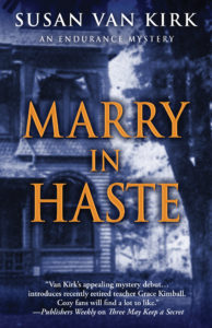 imagination and artist’s eye. I sent a photograph of a house that I used to live in years ago. This huge Victorian is essential to the story since both plots—from 1893 and 2012—are
  centered in this house. You can see how she expertly used a small part of the photograph [on the left.] A sixth point, perfectly shown by this cover, is the concept of having the font “pop” out at the reader. With dark blue background and gold/orange lettering, the book’s title literally pops out from the background. The dark blue, hazy, brooding color makes the house look mysterious and a little bit ghostly. That’s perfect. A cover should be about the genre you’re using; it should match the tone and mood of your book.
So, readers and writers: Which of these principles is the most important to you? What causes a book cover to stand out when you’re browsing?