We all know that book covers sell books. Duh. Cover artists and publishers connect complicated pieces and parts to come up with covers that sell, reflect the contents, promote a brand for a series, and fit the publisher’s catalog. I had not thought about all those moving parts until I received the third cover for my first Endurance mystery, Three May Keep a Secret. Same book, three different cover artists, three different publishers.
Today, I will reveal the third cover that came this past week from Harlequin Worldwide Mysteries. I had some input on the first two covers, but none on the newest version. Comparing it to the two earlier covers gave me lots of room to speculate.
 The first cover was done by Deirdre Wait of High Pines Creative.com for the 2014 Five Star Publishing version. I love this cover. It is bold, bright, and colorful, and the hues contrast so well you can spot it across a room (or a bookstore.) Fire is the main component, proclaiming its gigantic place in several pivotal scenes in the story. Fire is a major player in the plot, motivation, and murders in this mystery. The main character, Grace Kimball, is haunted by fire because of an incident in her past.
I also love the font Deirdre chose and the contrasting colors between the title and my name. Finally, the black background is a key player because this is a cozy mystery, but it has a darker side. Readers would figure despite its small town, colorful characters, and lack of explicit violence, the plot veers closer to a traditional mystery. Cozy but not too cozy. This was my first mystery cover, and I treasure it.
Later, the rights to this book were reverted to me, and I decided to self-publish Three May Keep a Secret in a paperback. I would need a new cover. This time I hired Karen Phillips of phillipscovers.com, to do covers for all three books in the series. New artist. Same book. Karen suggested we connect each book by creating similar elements, 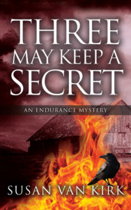 or a brand, on each cover. All three covers have a ribbon across the middle that says, “An Endurance Mystery,” the same font, and an item in the lower right corner. Love to work with an artist who also understands the business side of writing.
Karen also brought the fire center stage, but instead of a black background, she opted for a smokier color she contrasted with the title font. This time you see the barn that is a set piece for a major scene. Down in the lower right corner is an ominous-looking raven. No one had mentioned a raven until now. It is not only a symbol of death, but also an idea that sends Grace Kimball in another direction during her pursuit of the murderer’s identity. The colors in the background are still dark, but they are not black like the earlier version. This cover gives the genre of the story a slightly softer feeling, but the items on the cover are still dark symbols. Cozy mystery, but also with a bit of an edge.
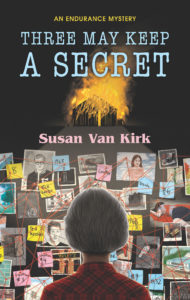 Here is the big cover reveal for the third version, a mass market paperback, of Three May Keep a Secret, launching on July 1, 2020 from Harlequin Worldwide Mysteries. Their cover artist, Jason Raish, imagines a retired Grace Kimball using her teacher organizational talents to help solve the murders. While the background of the cover is dark, the fonts for the title and my name are pastels in pink and blue. The burning barn is still there at the top, but not as central or apparent as the bulletin board in the foreground. While Grace does not have gray hair in the story, she is retired. I was delighted with the various characters, dates and locations pinned to the bulletin board. They still do not give away the plot, but they show that this artist did his homework on the plot elements.
The entire cover has a much softer tone—less black and fiery orange—with numerous pastel shades, and the prominent image on the cover is the cerebral solving of the crime. I might speculate that Harlequin knows their audience, and they are appealing to the over sixty-five crowd with the pastels and the gray-haired Grace Kimball.
Three covers, same book. The artists’ imaginations and interpretation of the novel are obvious in the differences in each cover. The various hues also set a tone in the reader’s mind. Finally, the audience the publisher is targeting determines many of these cover elements.
Three covers, same book. Imagination, emotion, and talent reveal three artists who know their craft.
Fascinating! Creating the right cover for (and knowing who is) the audience is vital. Thanks for sharing.
You are so right. I am fascinated by the way three different artists came up with these three covers for the same book. They are so different, and the new one is definitely geared to the publisher’s audience.
Quite a difference and, you’re right, each book cover creates a different feel. Do you have any idea how well each one did in selling your book?
Thanks for sharing. Very interesting.
That is an excellent question. Other factors are involved, however. The first book had great sales because my publisher had connections with libraries and actually did some promoting along with mine. The second cover book I published, and it did fine for a self-published author, but not the sales of the first one. However, I also used Kindle Unlimited and readers have read thousands of pages of the second cover book. So it’s hard to compare. The third cover won’t be out until July, and that publisher is worldwide, so again, not really easy to compare apples to oranges. However, if there were a way to do this, I’d love to see the results. Thanks for making me think about it.
Hmm…I thought I’d posted a comment but it seemed to disappear. This is a great post, and I will be sharing it on my blog on May 5th. My very first reblog! My initial impression was that I didn’t like cover #3 — then I realized it was a Harlequin cover, and that makes it perfect, because I don’t think Harlequin readers would go for the fiery covers. And I learned last year at LCC Vancouver how important branding was and subsequent revised all my covers with that in mind. Great post!
Thank you so much, Judy. I’ll look forward to your May 5 blog re-post. I have watched with interest as you posted about your book covers. Now I know why. You are so right that the audience makes a difference, and I initially wondered about the third cover, but it’s all about appealing to their audience.
Thanks so much, Judy, for sharing my post. I love this two-country collaboration! Good luck with your upcoming release…
I got here via Judy’s place. I must have overlooked this in April! Great idea for a blog. Such a difference in the covers–really interesting to see the concepts. Much luck on the new version!!
Thanks, Kaye. I am really happy with all three, and except for fire, they are all different. I love to see how these artists interpret my book.
Kaye, I’m so happy I helped you to discover this! So worth the read (as are Susan’s books).
Thanks so much, Judy. I will come over to your site and thank you also. I’ve been out of town all morning. Sorry.
Such kind words about my books. I appreciate it and the re-posting!